Colour is an experience generated by the senses. It is defined by the deep feelings it evokes. This time, Pantone has chosen ‘Viva Magenta’ as ‘Colour of the Year 2023’. It is bold, vibrant, fearless and striking and inspires emotions, strength and energy.
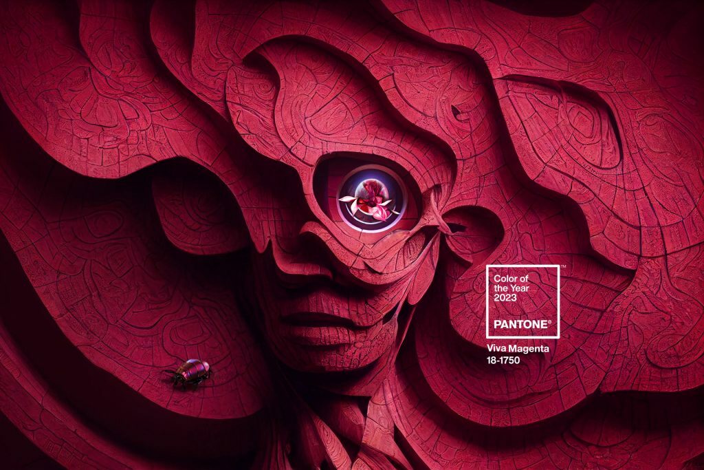
This choice was made by seeking the natural, real and authentic. Bearing in mind that technology predominates in the current world. Inspired by cochineal red, ‘Viva Magenta‘ is a hybrid colour. As such, it is a colour that oscillates between the fine line of light, cold shades based on a combination of carmine red, blue and pink.
It is a dominant colour, arising from events and trends in society. It also gives shape to the colour trend that will develop throughout 2023 in areas such as design, architecture and fashion.
“Rooted in the primordial, PANTONE 18-1750 Viva Magenta reconnects us with the original material. Invoking the forces of nature, it energises our spirit, helping us build our inner strength“.
Leatrice Eiseman, Executive Director at the Pantone Color Institute.
Colour, interiors and overriding energy through colour
As a bold and lively colour, painting walls in low energy areas is one option for the most daring decorators. Furthermore, adapting it to interiors will create spaces with real personality. Similarly, where it is combined with other more neutral elements it will create visual harmony, attractive for all the senses.
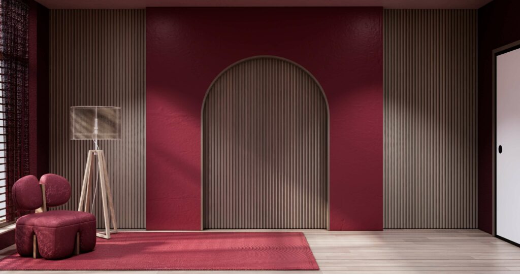
Image 1 Viva magenta Living room with red wall and japandi style armchair. – Stock photo
Another way to include ‘Viva Magenta’ more discreetly is through ornamental items. These could be paintings, glassware, textiles, lamps, furniture or other decorative pieces. All such items add a touch of joy, spreading this colour’s good energy and positivity in a more subtle way.
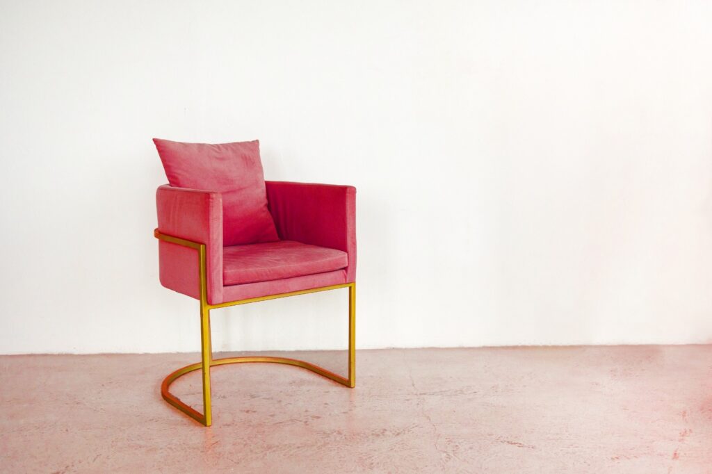
Image 2 Armchair in Viva Magenta tone. Fashion creative design 2023 – Stock photos
Vibrant architectural designs
‘Bridging Teahouse‘
FR-EE‘s ‘Bridging Teahouse‘ is one of 17 pavilions located in the Architecture Park of Jinhua Ai Qing City, China. This place is part of the 270,000 m² master plan for the Jindong District Commercial, Cultural and Entertainment Centre.
Both the interior and the exterior are made from a continuous concrete structure. It is arranged on the basis of micro-platforms and different levels. Aside from their striking design, the magenta also stands out, a symbol of prosperity in China.
The house explores the interaction between two traditional structures of ancient Chinese gardens: a teahouse and a bridge. Accordingly, the various platforms have different uses with their micro-atmospheres of privacy. In this way they create visual experiences and emotions for residents and visitors alike.
‘Stack By Step Red Zone Boarding House’
Another work with this colour that is striking for its architecture, creativity and resonance colour is the ‘Stack By Step Red Zone Boarding House‘ by Ismail Solehudin Architecture.
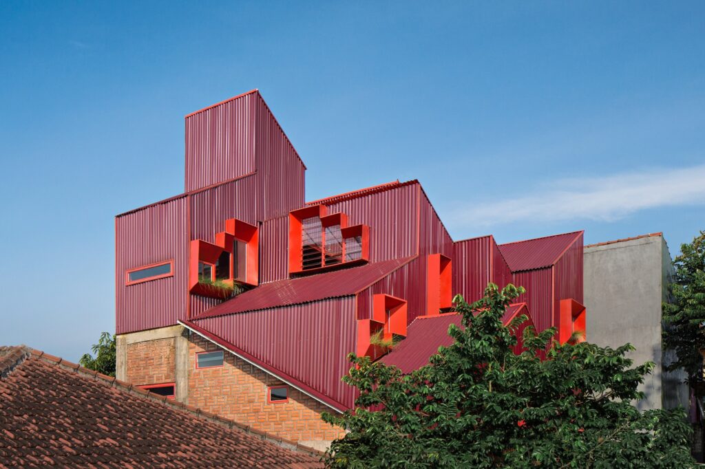
Image 3 – Stack By Step Red Zone Boarding House Ismail Solehudin Architecture.
This building is located in Bogor, Indonesia. With its light structure created with a steel and concrete frame it is finished inside and out with this magical colour.
The architects created an exclusive design by avoiding the typical single or double loading corridor for a multiple occupancy residence. Instead, they focused on the staircase as the only horizontal and vertical passageway between the units. The result was this creation.
The materials this structure is made of also minimise the need for maintenance, as they can be left to age naturally without repainting.
In addition, the materials used for this structure minimise the need for maintenance, as they can be left to age naturally without repainting.
Aside from the staircases, the building has communal areas on the ground floor that appear as an ‘empty space‘. In fact it has been designed as a communal area for residents to use for parking, laundry and storage.
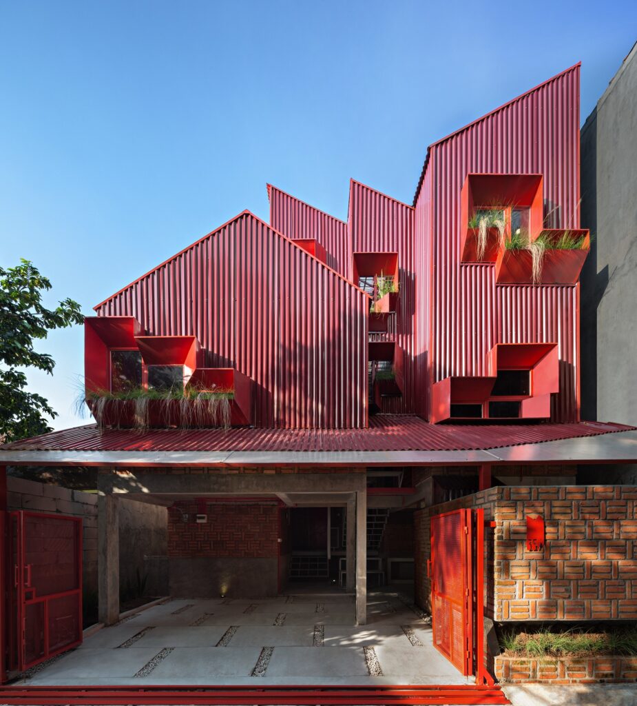
Image 4 – Stack By Step Red Zone Boarding House Ismail Solehudin Architecture.
‘Redline’
Pietri Architectes‘ design ‘Redline’, in La Seyne-sur-Mer, France, is another magnificent work worth mentioning. It consists of three separated parts with its base, slabs and sculpted mass of concrete. Two wings were also constructed connecting the building from east to west providing sea views.
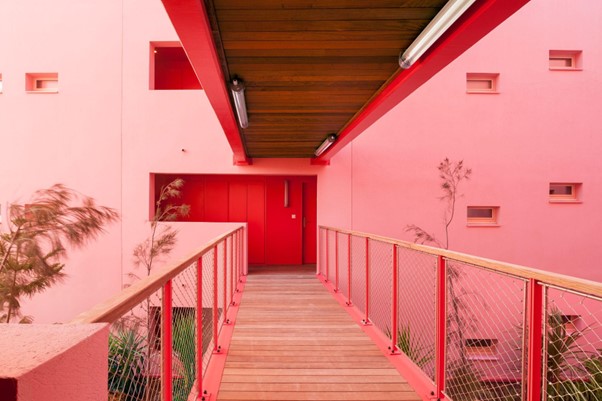
Image 5 – Redline building by Pietri Architectes.
Redline is a reconversion to encourage beach tourism in the French town with a 59-apartment complex facing Toulon and the Bay of Vignettes, one of the largest in Europe.
The result is a building that emanates design, light and vitality through the energy of colour.
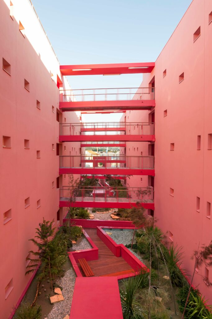
Image 6 – Redline building by Pietri Architectes.
These architectural examples show the connection and strength shared by the art of architecture and colour in creating emotions and fantastic structures.
The change of era and trends once more make their mark on timelessness. Marking another year in the most creative and perpetuating aspects of our lives: architecture and interior design.
Let’s open the door to creativity and welcome magenta, chosen by the Pantone Color Institute to give life, strength and vitality to 2023.