Creative influence and strength in architecture and spatial design lies in the importance of the now as a starting point—a source of inspiration for building design. Colours and morphologies bolster the importance of the present to open the minds of those visiting or living inside.
With the vernal equinox in the northern hemisphere now upon us, here at The Decorative Surfaces we take a look at projects that delve into colour trends and embrace a sense of springtime magic.
The brilliance of duality
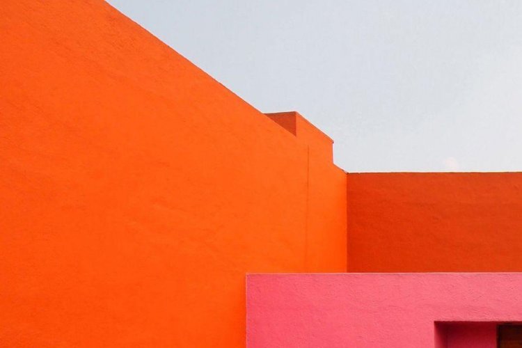
Oranges and pinks take on a matte slant this season to complement any field of contemporary creativity. These two hues enable us to experience the now through astonishing and energetic light. They spark emotion that immerses visitors and locals alike into a sense of happiness and positivity.
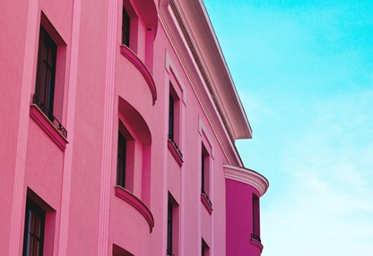
Pink concrete building. Timisoara Romania
Both colours are used as inspiration in three projects where energy and positivity are embodied by architectural structure.
‘Simone Veil’ group of schools in Colombes / Dominique Coulon & associés
This three-level project is an example of how the contemporary colour palette of pink and orange can run throughout to create vibrant sensations. Located in Colombes (France), this school structure morphs into a halo of necessary creativity.
The ‘Simone Veil’ group of schools were designed by the Dominique Coulon & associés architecture studio in 2015 and have become a prime example of the importance of creating spaces based on sustainability that reflect a human scale in urban settings.
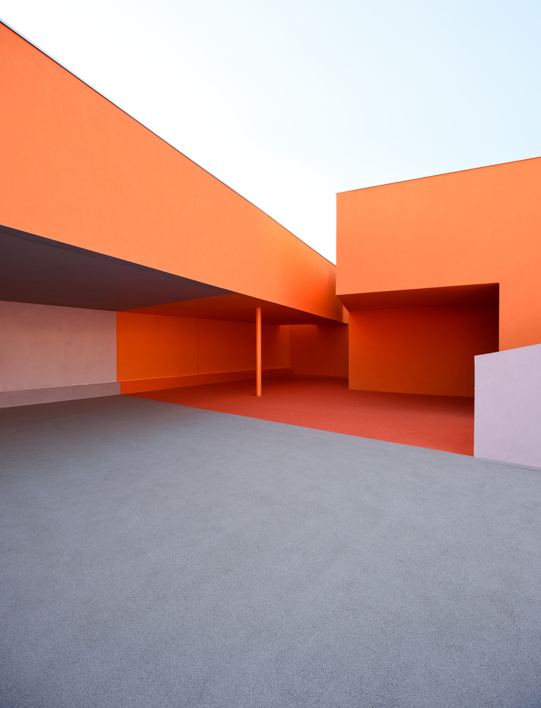
Photo by Guillaume Wittmann. ‘Simone Veil’ group of schools in Colombes. Dominique Coulon & associés. Source: plataformaarquitectura.
The building has been designed with textures and colours that distinctively shine through a pink-orange duality across the external structure and in indoor spaces housing the sports hall, cafeteria, library and classrooms. Light plays a standout role in how interior spaces are configured. It provides reflections that inspire and create an ambience dedicated to development and education.
Internal courtyards and transparency create a lateral displacement in the layout. A sensation of weightiness extends to the textured walls surrounding the space, sublimely combining with the light radiance of untreated wooden slats and other materials used to form a transparent enclosure. In this vein, a project that could come off as visually bulky is approached through lightness and airiness thanks to the selected materials and hues, conjuring a completely magical sensation.
‘Simone Veil’ group of schools in Colombes. Dominique Coulon & associés. Source: plataformaarquitectura.
Orange cube / Jakob + Macfarlane Architects
Positive energy emanates throughout this imposing and ambitious project from 2011 in the port of Lyon (France). The selected hues encapsulate and challenge urban space, conjuring sensations of a magical landscape.
With a view to creating an experience that brings together location, design and architecture, this octagonal design from Jacob + Macfarlane Architects incorporates several dimensional shifts. In this vein, the cube is centred around a large hollow that responds to actual needs: allowing light and air to pass, as well as creating distinct perspectives.
The colour palette inside and out has a clear conceptual approach. The orange hue used in each of the project’s materials symbolises industry—a sector with close ties to the surrounding area. And the lead paint exudes an inherent colour psychology in the urban setting of the port of Lyon, where the project’s high frequency vibe contrasts and interacts with the surrounding buildings. In this sense, orange invokes the innate strength and ambition of the project itself.
Sarbalé Ke pavilion / Kéré Architecture
The magic of contemporary seasonal colours is sensationally blended at the Sarbalé Ke pavilion—a temporary installation by Kéré Architecture for the Coachella Valley 2019 Music and Arts Festival (Indio, California).
As the lead architect on the project, Francis Kéré took inspiration from the natural landscapes of his childhood in Gando, Burkina Faso. The installation pulsates with colour and night-time illumination, focusing on an internal exploration of the baobab tree. It is an excellent reflection on materials, textures and spatial design in architecture that journeys through the morphology of the 12 Sarbalé Ke towers (‘The House of Celebration’ in Moore).
In this sense, the towers’ interiors function as a place to flow through multidirectional composition. The structures create an inner core filled with natural light and ventilation that evokes and brims with a magic for visitors to explore.
The different tower layers emanate a vibrant sensation through colour composition that contrasts warm hues, such as orange and matte pink, with calming blues. This temporary installation pulsates at a high frequency and creates an ambience brimming with magic, energy and positivity.
In this light, the pink-orange duality in the aforementioned projects conjures a sense of seasonal magic. These contemporary springtide hues embrace and envelop one another to draw us into the now, and bring us back to life.