Human emotions are sparked through reflections, perceptions or intuitions. External sensations that draw us into intimacy. Underlying every reflection, light and shadow we uncover, lies a framework ripe for analysis through theories. These theories empirically demonstrate how context is relevant to be deemed inherently personal. This theoretical framing applies to countless fields.

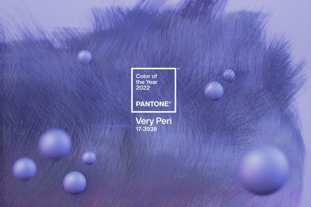
Pantone Very Peri
Very Peri, Pantone Colour of the year 2022
Here at The Decorative Surfaces we will use the Pantone Colour of the Year 2022 to understand how colour theory attains major emotional relevance in living spaces, using as an example an interior design project where the new colour is a main feature: a creative, passionate and hopeful vibration in tune with Very Peri.
Like every year, Pantone sets a colour trend that will define countless areas such as design, architecture or fashion—fields that could not be understood without modern-day contextualisation. This is how latent events and energy in society lead the Pantone Color Institute to set a prevailing colour every year. A colour that incites, transmits and represents. In 2022, Very Peri has been selected to embody the physical and digital world. And for the first time in history, the Pantone Colour of the Year is completely new.
Pantone 17-3938 Very Peri emerges from a combination of red, violet and blue hues. This composition incites imaginative expression and sparks creativity through its boldness, exemplifying the fusion of modern life with the digital world, as well as its feedback loop.
‘Creating a new colour for the first time in the history of our Pantone Colour of the Year educational colour programme reflects the global innovation and transformation taking place. As society continues to recognise colour as a critical form of communication, and a way to express and affect ideas and emotions and engage and connect, the complexity of this new red violet infused blue hue highlights the expansive possibilities that lay before us.’
Laurie Pressman, Vice President of the Pantone Color Institute
Hues that embrace living space: Café Krujok
The city of Voronezh (Russia) is home to a space where Very Peri is twinned with a confectionary concept. Thanks to its morphology and colour, this café space transports visitors inside the world of pastry-making and everything it involves.
The textures are a work of art that emotionally connect to our inner self, transporting and embracing us through colour. The project by architect Eduard Eremchuk and interior designer Katy Pititskaya is a fantasia brimming with magic and emotion.
Krujok, the café’s namesake, is a typical doughnut pastry from Russia and connects, complements and provides the interior design with a sublime, rounded finish.
The 100m2-space morphs into a glazed bread dough housing two different salons with a prevailing colour scheme throughout: Veri Peri, Pantone Colour of the Year 2022. Moreover, the textures combine the shine and crimps of viscous dripping dough to conjure a space filled with sublime sensations.
The very heart of this architectural space clearly connects with the underlying intention of the colour palette. Eduard Eremchuk ad Katy Pititskaya sought to invoke a space where imagination plays an essential role in practice. This is where the absolute relevance of colour can be appreciated, enticing a creative response in our inner self through suggestive delicate combinations in sweet pastel hues with velvety textures.
More from Café Krujok.
In this sense, the neutral walls combine with the Very Peri-coloured fixtures and fittings in a fantastical symbiosis. It offers a sense of hyperreality and a move towards the metaverse. This is where it ceases to be a digital fiction and folds into our unconditional surrounding reality.
The artistic composition of the vertical elements is a true highlight. Like puffs of corn, Russian artist Elena Minaev has created special decorative sculptural objects. The designs symbolise one of the specialities of the renowned owner and baker: doughnuts (or Krujoks) with caramelised popcorn.
The integrated furniture conjures pure bold fantasy: chairs are sculptures, tables are works of art and light fittings convey sensations beyond the mere functional.
In addition, the bathroom area embodies the texture and interior structure of dough, transforming into a soft, gooey, creamy sanctuary.
This different take on reality through fantasy textures is underscored by the colour palette. A vibrating hue that sparks and connects to the imagination. A colour that the Pantone Color Institute has selected as the prevailing tonal trend to clearly incite and expand the necessary and vibrant human emotions for 2022.

