Colour in art reflects an incredibly powerful emotional aspect playing with light and shadow. The theories around the visual perception of human brains create a set of rules and combinations that help achieve a desired visual effect.
In architecture, this harmony between light and shadow, combined with textures offered by different materials, enables us to create volume and space. The effect of light determining colour type has a major impact on how we understand and sense a building.
Since it is our nerve endings that interpret colour, it can transform our vision of the world. It is an essential element in building design. Here at The Decorative Surfaces, we take a look at three colours of the year from the Pantone Color Institute. These are used on designs that take full advantage of colour scheme to attain a remarkable result.
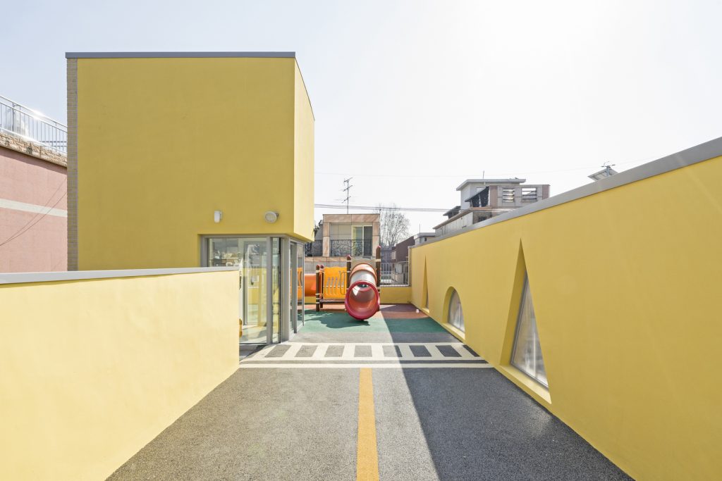
Illuminating yellow at Jaramteo Kindergarten
Illuminating yellow has been named Colour of the Year 2021, returning a worthwhile sense of wonder to the world. Alongside Ultimate Grey, the colour provides hope and recovered energy after the calm introspection of Classic Blue 19. This illumination is in line with 2021’s trends in architecture that we have discussed previously at The Decorative Surfaces. Opening up spaces and the need for natural light showcased at a structural level, as seen at this garden in Gwangjin-gu (South Korea).
A vibrant yellow hue floods the space with energy. All the while the positively soaring picture windows and geometric structures also provide a sense of life, as well as ventilation for the entire space.
Photograph by Gregori Civera.
The exterior material (yellow sun-dried clay bricks) provides the necessary warmth to attain perfect harmony with the surrounding homes. However, the sheets of yellow aluminium truly elevate the garden and spotlight a sense of joy. They also offer an emotional connection that can be summed up in a single word: resilience.
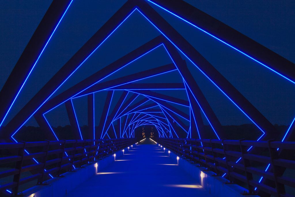
Classic Blue on the High Trestle Trail Bridge
Classic Blue (Pantone, 2020) emanates a sensation of calm and tranquillity. In this case, it is used on the High Trestle Trail Bridge located in Iowa, USA. Designed by the RDG Planning & Design studio, this footbridge is the fifth longest in the country.
Photograph by Gregori Civera.
A sense of chromatic irreality shines through where there is little natural light. The illuminated geometric shapes experimentally evoke the local mining culture and geology. This magnificent design is more of a collaborative installation. The canopy installation invokes the structure of an old mine shaft, transporting those who walk under it through both time and space.
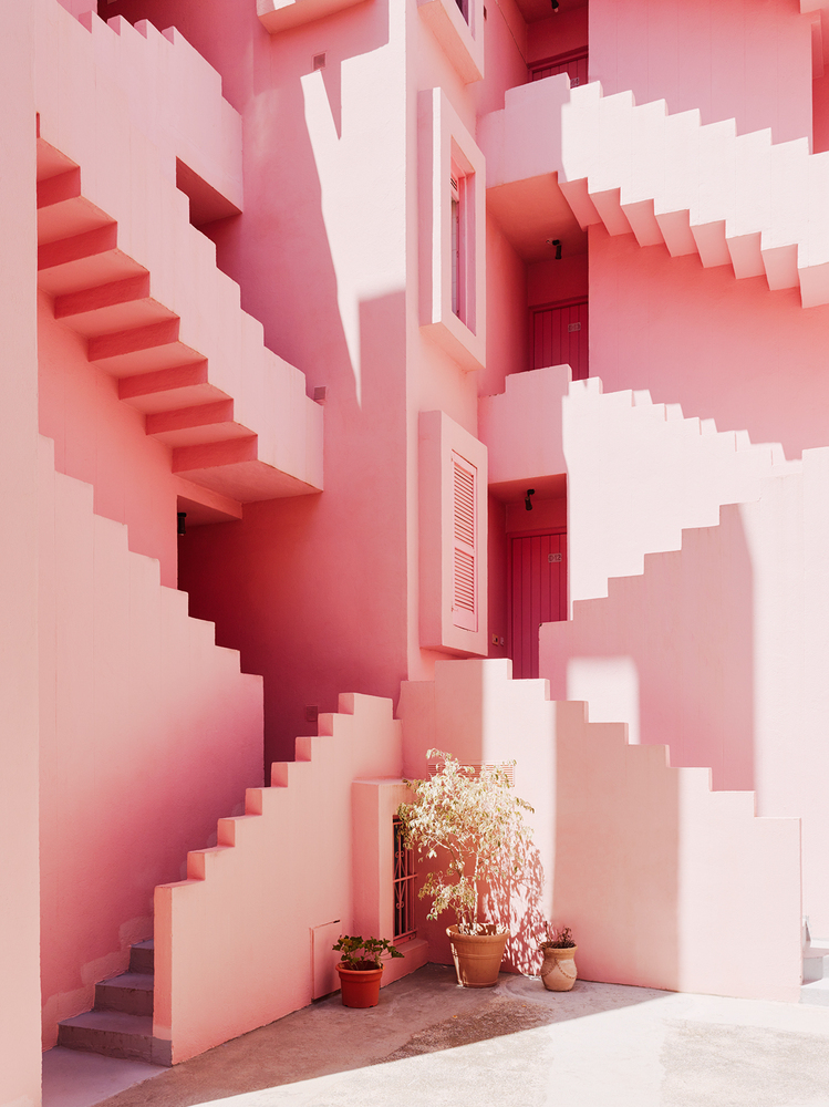
Living Coral at The Red Wall
The 2019 Pantone Colour of the Year is showcased in a work by Ricardo Bofill dating to 1972. Its Red Wall is a clear example of colour scheme poetics in architecture. The soft palette tempers the design’s shapes and sizes, providing a result that contrasts with the natural setting.
Photograph by Gregori Civera.
Its fortified aesthetic emerges from the rocks of a cliff in Calpe (Spain). It is evidence of the tension between the public and the private. It uses popular Mediterranean and Arabic architecture as a reference. The geometric stairs and circulation space house a colour scheme that brilliantly and purposely showcases the contrast and continuity with the surrounding area.
The façade uses Living Coral (named Pantone colour of the year in 2019). It’s a chromatic range that emerges from reddish hues and helps integrate and interpret the natural playful aesthetic of the building.